REM KOOLHAAS
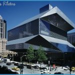
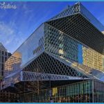
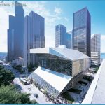
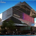
After detailed analysis of the basic needs of a library building, Rem Koolhaas conceived a radical architectural form to fulfill them. The arresting, multifaceted glass skin of the Seattle Central Library makes a dramatic statement in its city setting, yet the interior spaces work in practical terms. At the bottom of the building are the spacious Living Room and Mixing Chamber, the latter housing the library’s information hub. Beyond them rises the Book Spiral, a novel way of displaying the library’s collection in bookcases that spiral upward along a ramp so that volumes do not have to be moved between floors when new ones are added. A bold decorative scheme, marrying strongly patterned carpets with the glass walls, also rewrites the rules of library design.
REM KOOLHAAS
Born in 1944, Dutch architect Rem Koolhaas trained in London and New York before founding OMA (Office for Metropolitan Architecture) in 1975. His work includes large public buildings, such as the Nederlands Dans Theater at The Hague, the Kunsthal in Rotterdam, and the China Central Television Headquarters in Beijing.
Koolhaas is a Harvard professor, and his books on urbanism have proved highly influential among architects and designers.
4 EXTERIOR WALKWAY Running along one edge of the library, the walkway is bound on one side by a metal grid that encloses much of the building, and on the other by windows looking into the Living Room. The window glass reflects the diamond network of the grid, making yet more complex patterns of lines, and green plants harmonize with the carpet design, creating a visual link between the interior and exterior.
1 LIVING ROOM Situated at street level, this vast, multi-purpose space contains bookshelves, reading desks, and gathering areas all lit by an enormous sloping wall of glass. Carpets printed with a bold leaf pattern cover part of the floor. At the rear of the Living Room visitors can access the Book Spiral, which rises to a height equivalent to several stories.
3 READING ROOM This reading and study area is located at the top of the building. Unlike many reference libraries, where rows of desks occupy a somber or neutral space, Seattle’s has comfortable chairs for sitting and reading. From the sweeping glass roof to the swirling, purple-patterned carpets, the Reading Room is refreshingly unconventional.
1 Glazing
The huge areas of glass have been triple glazed to save energy. The glazing reduces heat loss in winter and prevents the space from overheating in summer.
IN CONTEXT
Practices such as OMA often produce strikingly unusual buildings. Their radical forms have been developed not merely for effect, but also to solve specific design challenges. To achieve successful results, the architects use computerized design and take advantage of new building technologies. Distorted towers, cubes with irregular windows cutting across them at odd angles, dramatic overhangs, and gigantic structures with little visible means of support have all become features of cities around the world. Breaking the boundaries of traditional architecture, they are helping to create a new urban experience.
1 De Young Museum, San Francisco
Swiss architects Herzog & de Meuron designed this arts museum in 2005. The bold, wedge-shaped tower is clad in perforated, dimpled copper.
ON DESIGN
The striking design of the library, which might at first appear to be a randomly organized set of shapes, was the result of very practical decisions. The architect conceived the building as a series of boxes (containing offices and rooms), and stacked these elements on top of one another before adjusting their positions. For example, moving an element to one side reduced the glare from sunlight in the Mixing Chamber, while another shift enhanced the view from the Reading Room. The diamond-pattern glazing that clads the main spaces adds to the multifaceted effect.

