1988 ART GALLERY OTTAWA, CANADA
MOSHE SAFDIE
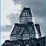
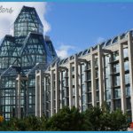
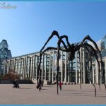
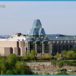
When designing Canada’s National Gallery, architect Moshe Safdie took an approach that was radically different from that of most art gallery designs. The aim was not only to house the national art collection, library, and archives, but also to provide elegant facilities for special events. Safdie fulfilled this brief with an outstanding building of granite and glass that combines strong, graphic lines and glowing, crystal-like pavilions with a series of spacious galleries that display pictures and sculpture to their best advantage. The corner pavilions have generous interiors flooded with light, as do the exhibition galleries, spaces for social gatherings, and the corridors between them.
The striking building is well-suited to its site, not far from the Ottawa River and with impressive views toward the city’s Gothic parliament buildings. The glass lantern roofs of the National Gallery complement the towers on Parliament Hill, and the daring cathedrallike proportions make it an imposing presence.
MOSHE SAFDIE
Born in Haifa (then in Palestine), Moshe Safdie moved to Canada when he was 15 years old and studied architecture at McGill University. He became well known when he designed Habitat ’67, a housing development based on three-dimensional prefabricated units, which was built for Expo 67 in Montreal.
This ground-breaking project, based on work he did while still a student, established Safdie as one of the prominent architects in North America. During the course of a long career he has had many major commissions in Canada, including Ottawa’s City Hall and Vancouver’s Library Square, as well as designing buildings from museums to university complexes elsewhere. His work is characterized by ingenious geometry and an innovative use of glass and lighting.
NATIONAL GALLERY OF CANADA CANADA
2 GLASS LANTERN Art galleries are often inward-looking structures, with blank outside walls that give little hint of what lies within. When designing the National Gallery of Canada, Safdie took a different approach, using glass widely and creating a landmark Great Hall with a high glazed roof rising above the granite and glass walls. The Great Hall forms an access point for the galleries and a generous space for special events. When lit up at night, the polygonal roof shines out like a beacon.
IN CONTEXT
Moshe Safdie designed Habitat ’67 to address the problem of how to provide high-density, affordable city apartments with the sense of privacy and access to green spaces common to suburban homes. His brilliant solution was to create 354 prefabricated cubelike living units that could be stacked on top of one another and interlock in an apparently random, yet highly organized way to create 148 separate apartments of varying sizes. Each home has a private terrace and is linked to the others by walkways and communal plazas.
The complex is a striking landmark set within gardens close to the Old Port in Montreal. Safdie had originally intended to make it much bigger, but it is impressive even at its existing size.
1 HABITAT ’67
The modular construction and landscaping soften the overall effect of the complex, avoiding the monolithic severity of many other 1960s housing plans.
1 ENTRANCE PAVILION Situated at one corner of the building, the entrance is a stunning space, roofed and partly walled with glass, designed to attract and to welcome visitors. The complex geometrical forms of its crystalline roof catch the eye, while the glass walls blur the boundary between exterior and interior and admit the maximum amount of light.
1 INDOOR COLONNADE From the entrance, visitors walk the length of this tall passageway. With its soaring granite columns and pitched glass roof the colonnade resembles the nave of a cathedral. The floor slopes gently upward, and walking up this ramp creates a sense of anticipation as visitors approach the Great Hall at the far end.
1 EXHIBITION SPACES One of the key features of the building is the quality of light in the galleries themselves. By using a mixture of skylights and mirrored shafts, Safdie introduced natural light.
In some rooms curved ceilings add character. Painted white, they reflect light on to the paintings, making it easier for visitors to pick out details.

